Makeup Recycle Program
Summary: Integrating recycle program for beauty industry in consumers’ shopping experience
with physical and digital prototype
Team Members: Janice Lin, Bblythe Wu
Duration: September – December, 2021, 10 weeks
My Role: User Research, Usability Testing, Field Study, Survey, Team Building, Secondary
Research
Tools: Figma, Physical Prototype
Design Question
How can we encourage the consumers to engage more in the makeup recycle program to reduce makeup plastic waste in department stores and on official websites?
Background
Every year, 120 billion units of packaging are produced by the cosmetics industry globally and most of them end up in landfills and oceans[1]. According to our survey result, the recycle rate of empty or expired makeup containers is about 13%.
Our main goal is to enhance the beauty product consumers’ recycling behavior for reducing the plastic waste. Our prototype is a mobile app, integrating with new physical packaging, that allows beauty product shoppers to participate in the recycle program for recycling empty plastic containers.
We hope to form a partnership with the waste management companies such as TerraCycle, department stores, and their official online retailers. In this study, we present a low-fidelity digital prototype via Figma and updated information printed on physical packaging.
Secondary Research
For the secondary research, we applied the methodology of looking up online statistics, data on Statista and findings on academic papers and popular media, and checking out makeup brands' official website and content. We had several key insights:
- 120 billion units of packaging are produced by the cosmetics industry globally and most of them end up in landfills and oceans.[1]
- Young women mostly apply makeup several times per week.
- At least 126 million people who have used makeup in the US.
- 50 percent of people don’t even try to recycle their empty containers as it is deemed “inconvenient”.[2]
- 70% consumers want more environmentally friendly products, but they are not willing to compromise on performance, aesthetics or value brands implementing eco-friendly designs.[3]
Primary Research
We approached our primary research with 2 methods: field observation and survey. We chose these 2 methods because they were effective and comparatively less time-consuming for collecting both qualitative and quantitative data. We focused on 3 different areas while conducting our primary research:
Field Observation
For field study, we applied the method of deep hang out and pure observation. Our field study mainly focused on the offline shopping experience from makeup consumers in 4 different makeup stores in Bellevue Square. We chose Lush, M·A·C and BareMinerals as the stores that have recycle programs compared with Sephora as the stores that does not have the recycle program. We utilized deep hang out first in Lush, M·A·C and BareMinerals and asked for the permission, then we utilized pure observation in each store for 0.5 to 1 hour.
Key Insights:- Although recycle programs exist, no one talks or asks about it.
- No one has returned any plastic containers in the store.
- Consumers’ attention is fully on the product itself.
- Eco-friendly signs are not as obvious as other advertisements or promotions.
- No displayed information about the recycle program in the store nor on the packaging.
- The interaction between the sales representative and the consumer is mostly based on the product’s functionality.
I have learned that observing real user behavior in the real scenario was hard. I needed to pretent as a shopper, while taking notes and observing them secretly. However, I got super surprised about some of the observation results. For example, during our deep hang out, the sales told me that the current recycle program is running pretty well, and they would ship the returned containers which the amount is usually over 1000 monthly. In fact, as we observed during the busy hour on weekends, we found no one had recycled in store.

Survey
In the survey, we asked respondents about their general recycling behavior and questions related to the currently available brands with recycle program. Some of the questions we included:
I have learned that survey is a fast way to gather user's thoughts. But it does have some limitations. For example, it cannot be long; the current free surveying tools have few options of directing questions which potentially bring technical issues. In the future, we should create a flowchart for each branch so it is easier to visualize the logic for better structure.

Data Analysis
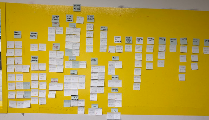
In this stage, we had already gathered our primary and secondary research, we utilized the affinity diagram, persona, scenario, storyboard, and brainstorm to analyze our data. Then, we came up with our requirements.
Affinity Analysis
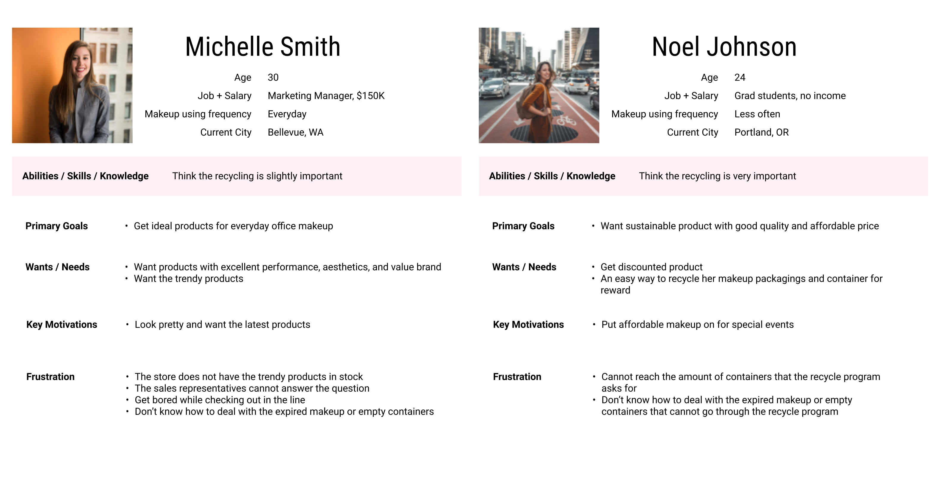
Persona
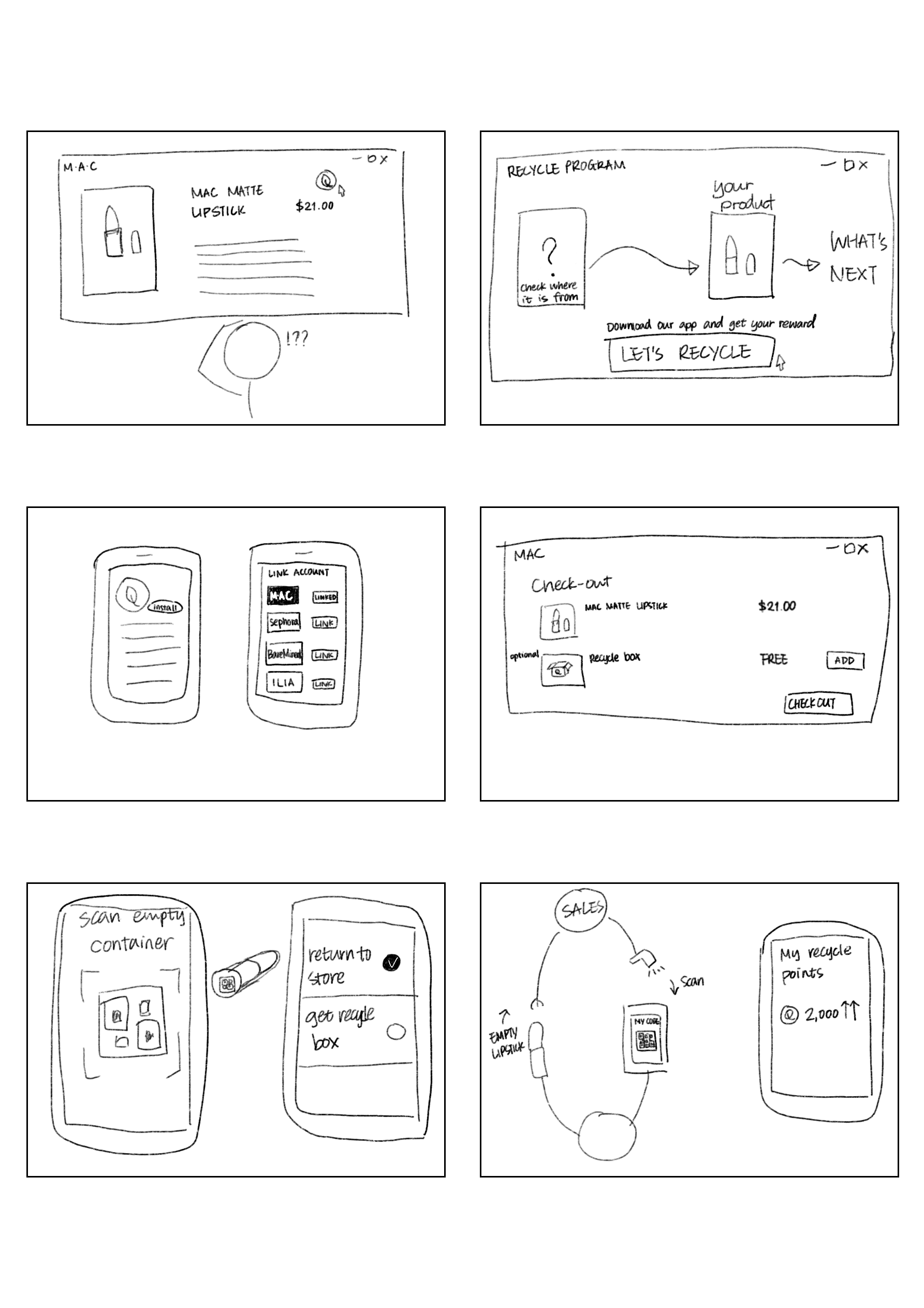
Storyboard
See another storyboardScenario
#1. Scenario
Michelle Smith is a 30-year-old Marketing Manager that earns $150K a year. She uses
makeup every day. On weekends, she goes to MAC to buy some foundation and lipsticks. She
doesn’t care about any recycling program information and just wants to purchase the
products and try some new products. Due to the high frequency of makeup purchasing, she
has a lot of makeup that she cannot use up. When she wants to throw away her expired
makeup, she cannot tell whether her lipsticks are recyclable or not. Also, she doesn’t
want to clean the residue in the containers. So she just throws all of them into the
trash.
#2. Scenario
Noel Johnson is a 24-year-old graduate student that has no income. She only uses makeup
when she goes to big events. She bought one lipstick from MAC 2 years ago. One day, she
somehow remembers that MAC has a recycle program, but she doesn’t find any related
information while browsing through MAC’s official website. Then, she chooses to go to
the MAC store to recycle it. However, when she brings it back to the store, the sales
representative tells her that she needs to bring back at least 6 empty containers for a
reward. She is disappointed about it since she doesn’t use makeup often. It’s really
hard for her to collect 6 empty containers, but she actually really wants the reward and
to be eco-friendly.
#3. Scenario
Emma Collins is a 28-year-old actress. She used makeup every day and often has used up
makeup containers. When she wants to dispose of the empty bottles, she suddenly thinks
of the recycle program that the MAC has. But she currently doesn’t want to go to the
store to return and also doesn’t want to keep them occupying the space on the table.
Furthermore, the rewards that MAC currently offers have no appeal to her. She decides to
throw them in the trash bin, considering how inconvenient it is the existing recycle
program, and feels indifferent about the rewards.
Takeaways
Data analysis was not easy after collecting a whole bunch of qualitative and quantitative data. This process helped us to build the skill of analyze data in a macro view that considers all of our secondary research, field study, and survey.
Ideation
Brainstorm
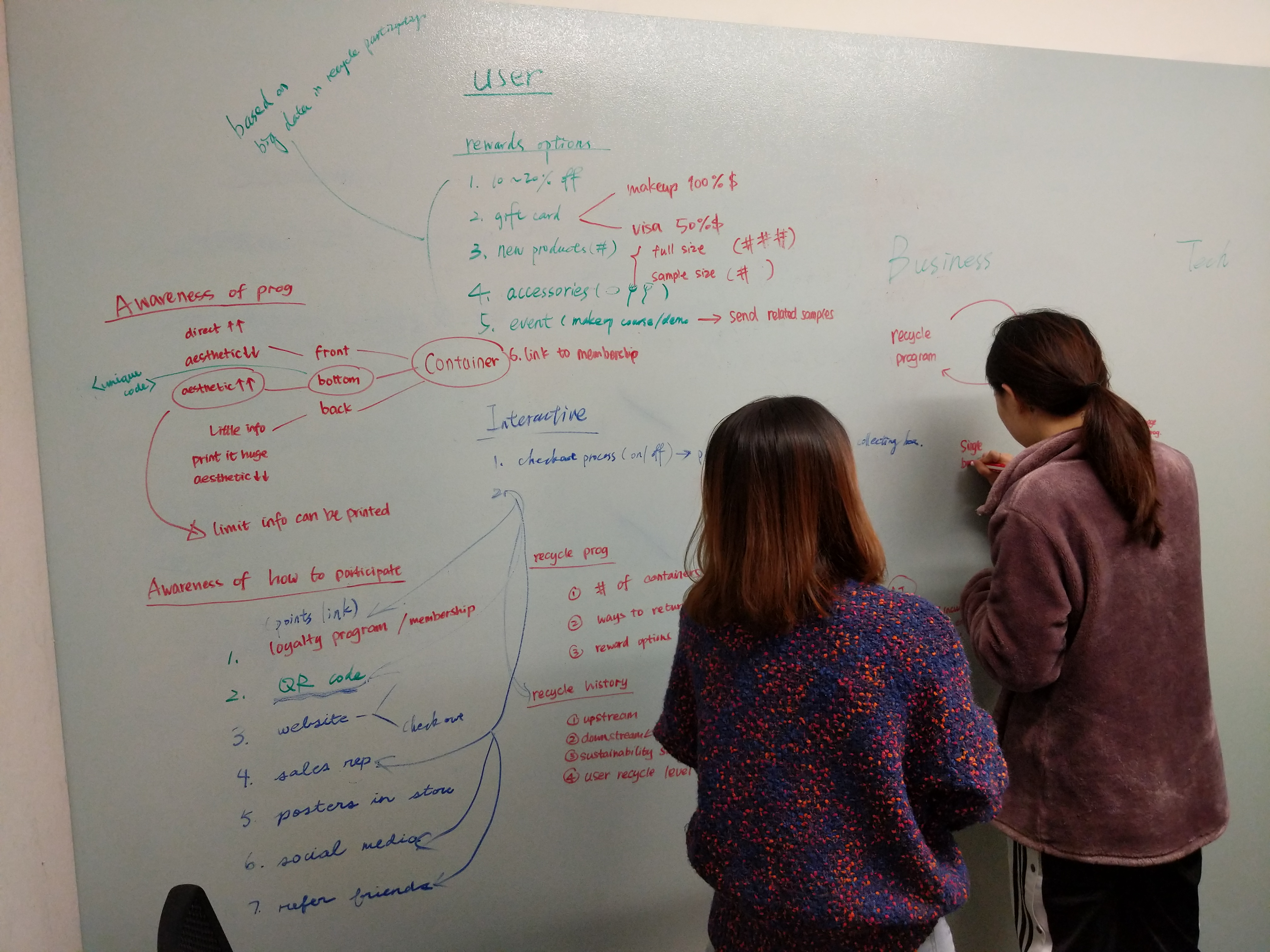
Requirements with high priority
-
User Experience
- Recycle signs or information should at least be printed.
- Eco-friendly products should not be reduced with their performance, aesthetics, or value brands.
- Recycle programs should be easier to approach for consumers who are willing to recycle back.
- Sales representatives can be actively involved in the recycle program.
-
Business
- The process of recycling should be simple and convenient.
- The recycle program mechanism should be more gender neutral for all age ranges.
- Businesses should advertise their recycling program better.
-
Technology
- It should be motivating consumers' recycling behavior
Takeaways
During this process, we had been arguing a lot. Each member had different standard when facing the problem. Thanks to the discussion, all the thoughts were valuable for driving to shape our final idea.
Solution
To fulfill our requirements, our team came up the solution of changing the information on the packaging that potentially leads consumers to use our digital recycle program app. Besides, from the qualitative data analysis, instead of undiversified rewards from each brand, we combined all brands together and wanted to provide different kinds of rewards neutral to all genders and ages.
Usability Test
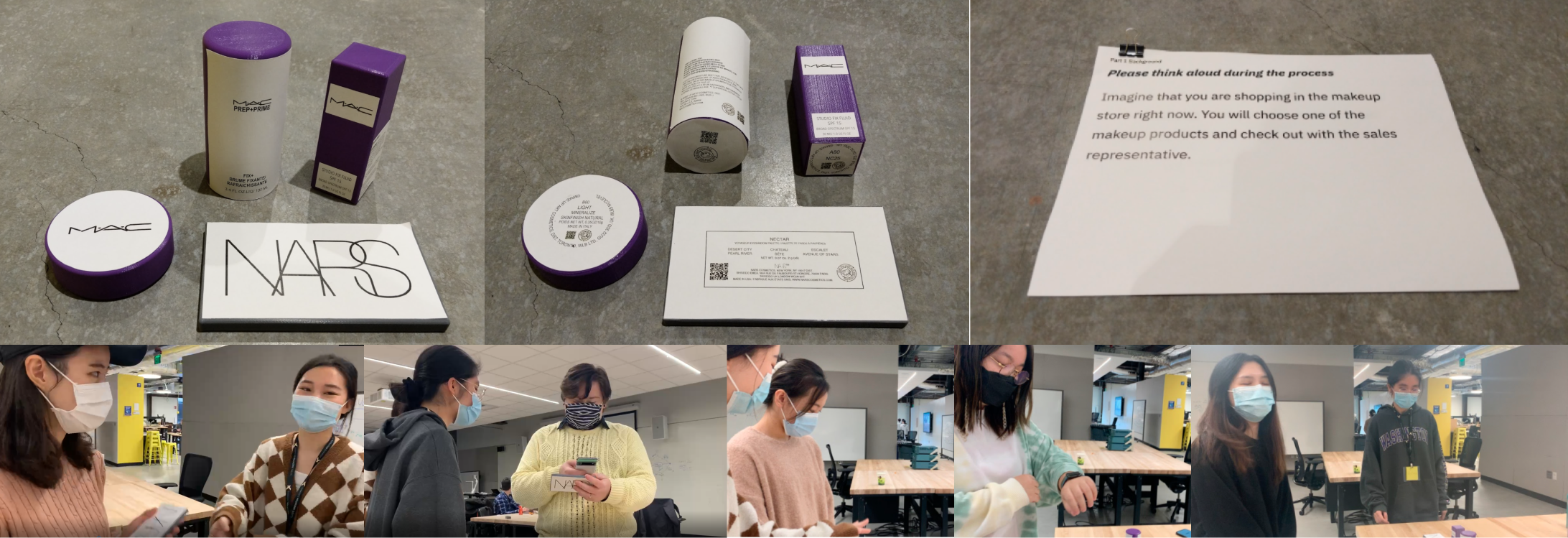
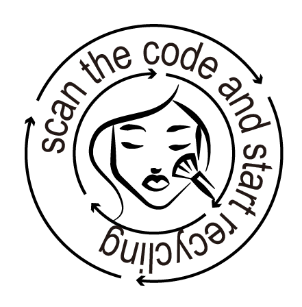
For our usability test, at least two team members were present during the 5 test sessions. One team member was in charge of videotaping/taking notes, while the other member facilitated the session and pretended to be the sales representative. As a facilitator, the member would read the tasks to the participant and answer any questions in regards to the tasks. In the sales representative role, the member would inform the participants about the recycle program during the checkout process. Our team created a Figma low fidelity prototype of the application for the participants to interact with. The physical prototypes, the makeup containers, were printed by 3D printers. Lastly, we modified the makeup labels with a recycle sign and QR code in Illustrator and glued them onto the physical prototypes.
Walkthrough
Key Findings
Takeaways
From this evaluation, we could figure out how successfully our prototype communicates with the users. We intially thought the QR code would be fairly noticeable on our physical prototypes. However, there were some participants that were attracted to other information instead. This goes to show that our design may not be as intuitive as we thought, and that we should look into revising it if needed. It also show what types of information is important to the participants, so they may be actively seeking those information.
For further iteration, we would change the physical design, adding a piece of outer packaging to the product and clearly indicating the recycle program related information.
Reflection
Diversity
This 10-week collaboration experience was so different, compared to my previous experience in cognitive science or computer music study. Every team member in my undergrad was having the similar thinking path, so our solutions were not too diverse or unexpected. However, as a team, Janice has business background, so she paid more attention in if it’s actually can work or not in reality, and Bblythe is from landscape architecture, who cared more about systematic logic framework thinking. I, as a musician, usually had creative ideas initiating our arguments. Overall, we have lots of fun in this 10-week design thinking process and learn a lot from each other.
Problem Driven
Design thinking should be problem driven, which was totally different from the design framework that I truly applied before. I was always thinking of the solution when first facing the problem that I was going to deal with. This bad habit and bias actually narrowed my thinking and ability to accept various ideas. During this project, I deeply felt about how important the problem driven process was and not thinking of the solution until the ideation stage. In this path, I can truly put myself into users' shoes and empathize the real scenarios.
Design Thinking Application
Within this 10-week "brainwashing" design thinking, the framework has built into my mindset. As for doing another school project and deciding its problem statement and direction, finding second research and backup evidence was extremely helpful to guide our path for digging more in. Thanks to design thinking, I have been changed to ask more questions started with WHY, HOW, and WHAT, instead of only focusing on the solution.
Design Topic Influence
We have been practicing to recycle correctly since we got this design topic, which we did not really pay attention to before. Since the design that we made is to help make the world better, and our design process focused on human behavior a lot, the design thinking helped us to expand our vision. According to the reasearch that we have done, a good design not only can make users’ lives easier, it also can reshape designers’ perspectives unintentionally and help us to be better people.
