Canvas Student App Inbox Redesign
Summary: During the pandemic, more and more students start to choose mobile apps for facilitating remote learning.
Canvas is the learning system that UC San Diego has been using. However, we found that the inbox organization is ineffecient,
and thus redesigned the inbox page for enhancing the usability.
Team Members: Jinghan Cao, Michael Lyken, Nguyen Nguyen, Jieying Lou
Duration: November - December 2020, 3 weeks
My Role: Team managing, user testing, drafting redesign sketch, designing high-fidelity redesign prototype, contributing in all parts of the write-ups
Introduction
Why choosing Canvas Student app
Canvas student app is one of the most popular learning management systems and we use it almost every day to access course materials, check announcements, check grades and so on. We are interested in this app because during the current pandemic, the usage of online learning platforms has increased and using Canvas app (and other similar platforms) becomes an important part of our lives. By doing user testing and redesigning the Canvas Student app, hopefully we can make it more effective in facilitating remote learning.
User Selection & Limitations
As university students during a pandemic there has been an increase in platform usage, and with that comes familiarity and inherent user experience. Following, we selected Canvas as our platform of choice since we as university students use it very frequently, so in selecting fellow students they are valid users because they too are required to use this platform to succeed. However with selecting university students there can be a range of feelings and emotions about the platform, and with that there can be an inherent bias. For example, if one is still used to the previous platform (Blackboard), they may not be all that familiar with Canvas and may be limited in their knowledge of the platform. Also, users may be extremely comfortable with the platform, so there is a chance that we will have extreme outliers in our data.
1st User Testing Plan
Tasks:
How to capture the answers:
1st user testing results & analysis
Top 3 Usability Errors for each user
- Cannot view group submissions. (Visibility of system status)
- Cannot read all unread messages in “inbox” at once. (Flexibility and efficiency of use)
- Unread messages from previous quarters are not archived. (Flexibility and efficiency of use)
- Lacks “submission details”. (Visibility of system status)
- Filtering in “inbox” is not specific enough. (Flexibility and efficiency of use)
- No searching function in “inbox”. (Flexibility and efficiency of use)
- Group submission details not shown for those who did not do the submission. (Visibility of system status)
- Can not identify TA in “inbox”. (Recognition rather than recall)
- Messages in “inbox” are not organized. (Flexibility and efficiency of use)
- Tabs / Links to external sites without warning. (Help users recognize, diagnose and recover from errors)
- Messy layout and unused space. (Aesthetic and minimalist design)
- No mass delete in “inbox”. (Flexibility and efficiency of use)
Analysis
Among the four users, only one user had problems with finding the feedback of an assignment. For the other three users, it is pretty easy for them to view feedback, mainly because they have been using the Canvas Student app for a while. In fact, the feedback is located under the “submission & rubric”, which can certainly confuse the users, causing them to ignore the tab and then cannot find any feedback through the mobile app.
When performing the task of submitting group assignments, no users had problems doing it but all of them did it the same way as submitting individual assignments. The “group” section on the homepage did not provide ways to submit group assignments. Also, there are problems if they are not the ones to submit assignments, as it shows the assignment is missing on their ends even though the other members have already submitted it.
Three of the four users encountered problems when performing the task involved using “inbox”. The “filter” in the “inbox” only provides filtering based on courses and is not clearly organized or displayed. Users also had problems looking for a particular message as they can’t recognize the TA’s name and the overview of a message sometimes doesn't show what course it is from. Also, since there are many messages about updates of zoom meetings, and there are no mass select functions. Since students are receiving Canvas messages via Gmail simultaneously, three of the users would prefer to check their email instead of Canvas, thus it often leaves users with many unread messages in Canvas.
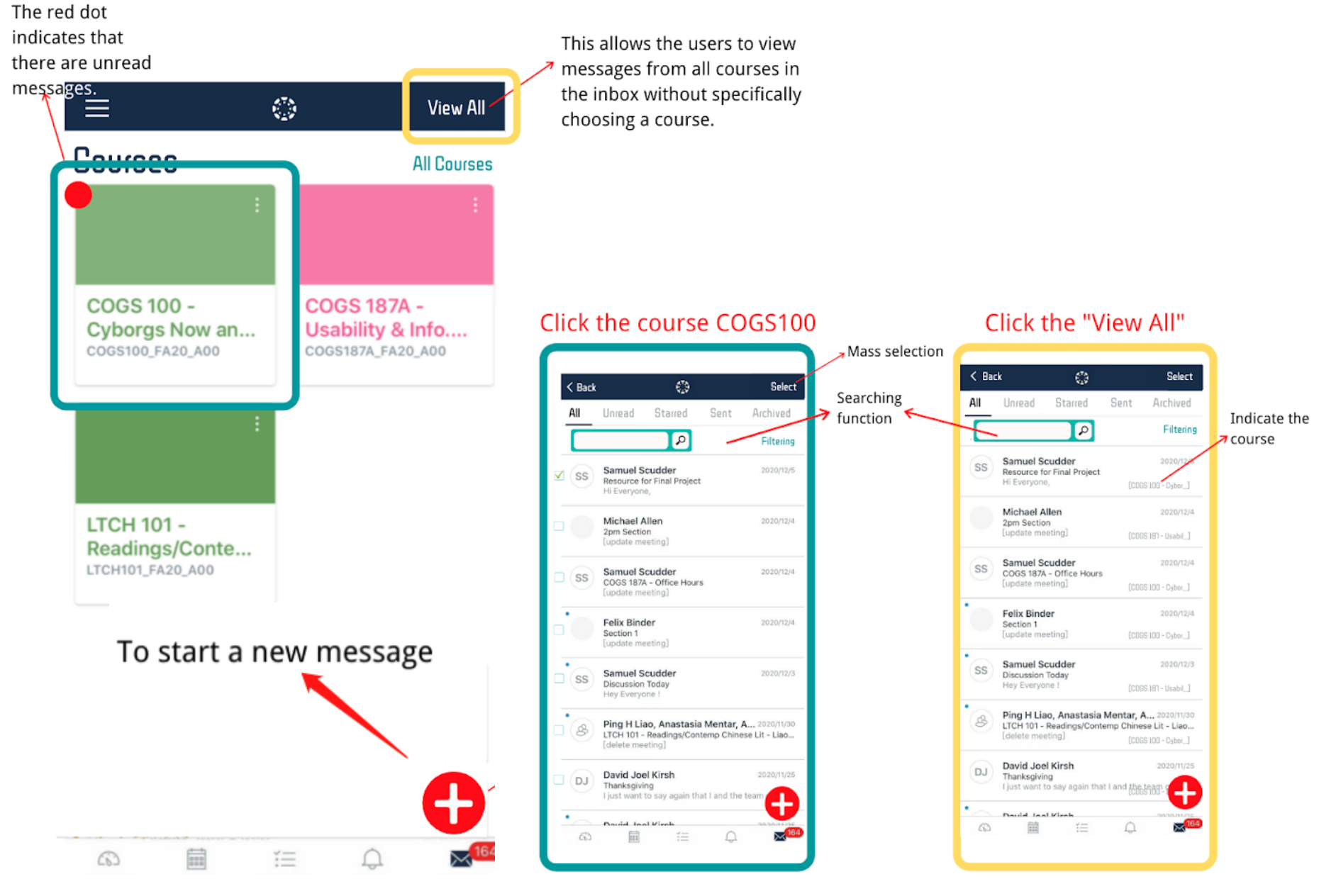
Annotated Screenshots of Inbox
Problem #1: The filter function is overall messy and lackluster
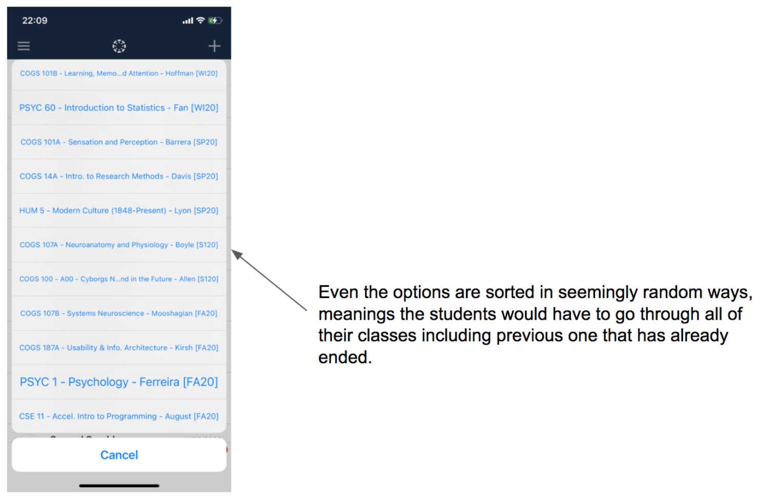
Its main problem is that you can only sort by courses and that having one restriction when it comes to sorting is not specific enough for the function to be genuinely effective.
This violates the heuristic of aesthetic and minimalist design. The different font sizes have no aesthetics and make users hard to read. Besides, it violates the heuristic of flexibility and efficiency of use because users have to pick their current enrolling courses among all courses that they have already taken, and it slows down the users instead of an accelerator.
Problem #2: The ineffecient organization of the messages
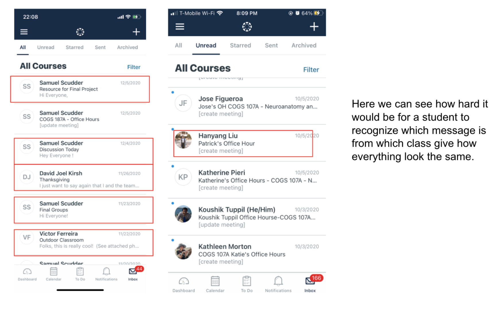

In the inbox, it lacks simple visual cues to help users instantly categorize messages in their head. Users had a hard time identifying the TA and didn’t know what course the message was sent from. For examples, simple visual cue such as tags for meetings, tags for sender (TA, Professor, or Other Students), color code for different classes would help student tremendously in figuring if the message belong to the dozens of spams zoom meeting that they get everyday or if its an actually important announcement being made by the professor.
This violates the heuristic of recognition rather than recall. Users have to recall their professors and TAs’ names while they are checking messages without any information related to the course.
Problem #3: The lack of organization tools given to users
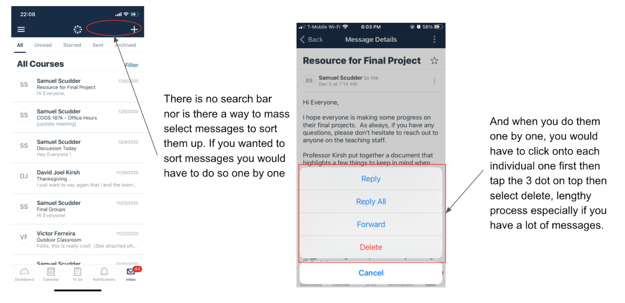
There is no search bar nor is there a way to mass select messages to sort them up. If you wanted to sort messages you would have to do so one by one. And when you do them one by one, you would have to click onto each individual one first then tap the 3 dot on top then select delete, a lengthy process especially if you have a lot of messages.
This violates the heuristic of flexibility and efficiency of use. Because the process of making changes is too redundant, and users cannot adjust each message on the inbox homepage. They have to access the third-level page to adjust a single message.
Competitive Analysis
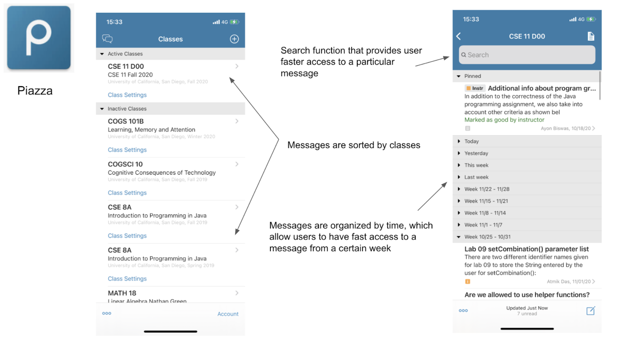
Piazza
We choose Piazza as one of our competitive apps. Piazza is an excellent example of messaging for school courses. On the homepage, it separates messages into courses with active and inactive dividers. It is a straightforward design for users to check on each course’s messages instead of constructing all inbox messages. Within each course, it provides dividers for each week. Although it violates the heuristic of recognition than recall, it is still a good way to organize all the messages with a timeframe.
This provides an optional solution for the first problem we identified in Canvas Student app. The separation of courses in advance will give users helpful guidance on what they are looking for. Besides, the timeframe will provide users with organized messages in the inbox.
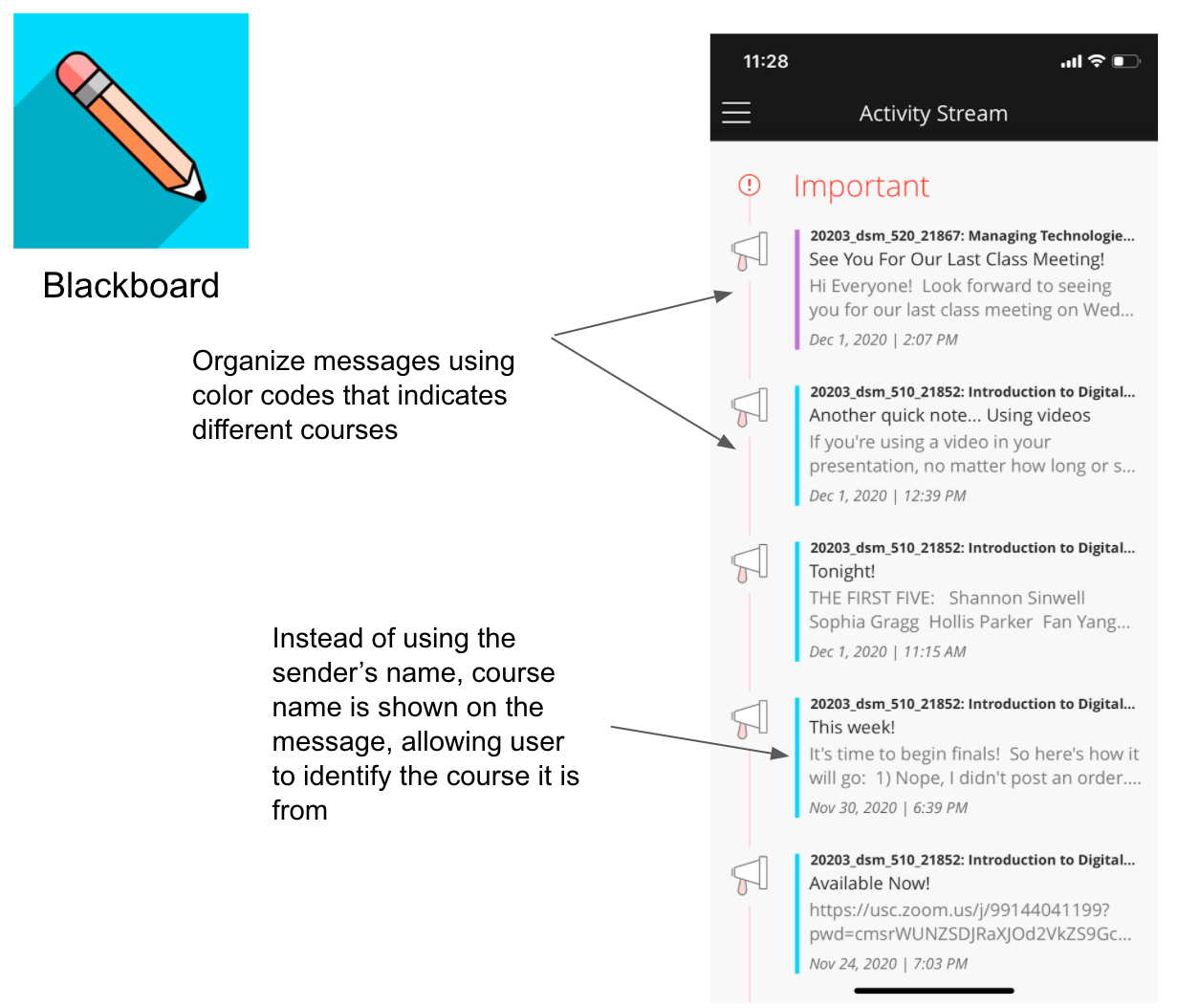
Blackboard
Blackboard is an app functioning similarly to Canvas Student App. In the activity stream tab, which has a similar function to the inbox, each message is specified with the course information, including the course ID and the course’s name, and color-coded.
The color coding and the specification of the course information could solve the second problem we identified in Canvas Student app. This will give the users a more precise guide for what they are looking for. Color coding matching with the course color will enhance the aesthetics and visual cues for the users.
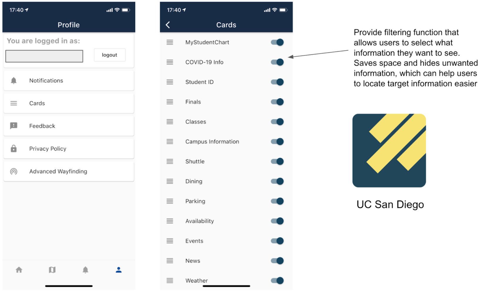
UC San Diego Mobile App
UC San Diego mobile app provides a clear organization of filtering what users want to see on the homepage. This filter gives users flexibility and control of selecting information as well as the visibility of system status.
This organization of information could solve the first problem we identified in Canvas Student app. We can put for options in the filter besides the courses enhancing the flexibility and user control.
Sketches
Prototype Redesigns & Rationale
From the user interview and testing, we learned that people use Canvas Student app mostly for checking information (announcement, messages, grades, etc.). We found that the interactivity and content on the inbox page is badly managed. The messages in the inbox are not organized nor categorized and users had problems finding target messages.
Prototype 1
By Yunfan Zhao and Jinghan Cao
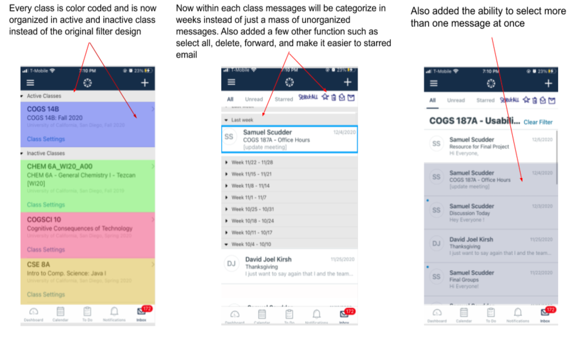
We color coded the messages and added the course name on each one, giving them categorizes, because users sometimes have a hard time identifying the TA. With the course name, users won’t have to click in message details to see what course it is from.
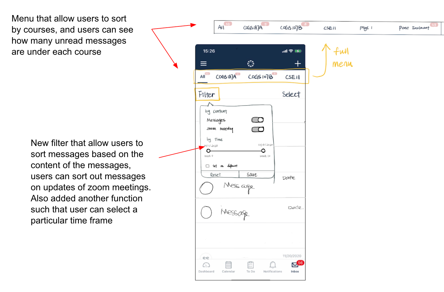
We changed the top navigation bar which previously supports viewing unread, starred, sent messages to one that allows users to switch between different classes and see only messages from one course. From the user testings, we found that users rarely use the function to view only unread, sent, starred messages, but rather will look for messages from a particular class. We changed this top bar so that users will have quicker access to a particular message.
We changed the filter to support more filtering functions. As we changed the top navigation bar, we moved those functions into the filter tab and users can still view only sent, starred or unread messages.
We also added a function that allows users to select time frames because it narrows down the number of messages and helps users save time finding target messages.
We provided a way for users to hide messages on zoom updates. Most unread messages are those about updates of zoom meetings, and there were so many that they take up much space on the inbox page. In the filter, we added a function for users to view only messages and hide those about zoom meetings so that distractions are reduced and users can access target messages faster.
Prototype 2
By Nguyen Nguyen
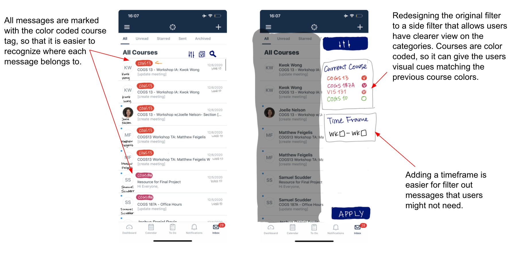
Instead of showing all messages instantly when the user clicks on inbox, we added a step for users to select the course first. We made this change because this way the messages are organized by courses and users can have faster access to messages from a specific course.
We added a timeline on top that allows users to view messages from a certain week only as the quarter is usually divided into weeks, we thought it would be helpful to show what week it is, and categorize the messages by the week it is from.
Similar to the first prototype, we moved the unread, starred and sent tabs into filter because we found that these are not often used by users, and instead we put the timeline on top
In the filter, we added functions that sort messages based on the senders so that it is easier to locate a message from a certain sender.
We also added a search function that if users have a target message they couldn’t find it.
2nd User Testing Plan on TWO Redesigns
2nd User testing analysis
When redesigning the inbox page, we focused on making the contents more organized. We have done so by adding different categorizations that make the interactivity more flexible and efficient. In the second round of user testing, we found that some of the redesigned parts worked well while some did not work as expected.
What DID workCategorizing the messages by courses increases the efficiency of use, and helps users when they are looking for a message. The course labels on the top (redesign 1) work well as they help users identify the messages. The timeline (redesign 2) also worked as it provides faster access to old messages.
What DID NOT workThe filter did not work as expected. We thought it would be helpful to have categorizations of messages so that users can filter out unwanted messages. However, it did not work as it increased the workflow for some users. Users would want to scroll rather than clicks a couple of times.
Lessons learned
From the user test on our redesigns, we figured that some problems we identified might not be a good representation of the problems for the population due to the limited number of users we have. While it can be easier for someone to locate messages using the filter, it’s true that for someone else using the filter increases their workflow. we noticed that in the 2nd user testing, some of our users rarely use inbox although they use the Canvas Student app. These users receive relatively little amount of messages from the professors or TAs at school and they thought the filter is unnecessary. We learned that there is always a tradeoff when making changes. When redesigning a component, we should test it thoroughly with enough users to make sure the tradeoff is worth it.
Besides, we found that it could be difficult to select users to test redesigns since we have to consider people who are users or potential users of the app while at the same time they might already be familiar with the app. It is hard to test the redesigns when we don’t know whether the users’ reactions are due to the lack of effectiveness of our changes or simply because they were too familiar with the old versions.
Recommendations
After a series of user testings, we have the following recommendations for the Canvas head designers: